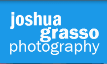
I have learned a lot about design and yet i’m still not very good at it. Design is one of those things that you are either good at or you are not. But don’t despair if you do not have the symmetry gene, if you keep things simple you can still create a respectable brand on your own. I’m going to walk through the process for my logo to provide a little insight in how to create a basic photography logo.
1st step. Keep things simple and don’t use silly fonts.
A photography logo needs to be clean and simple just like a good photograph. Since you are often placing a logo on a photograph you do not want one that distracts from the image.
Silly fonts don’t work. You are not going to impress someone with a “fancy font”. When I first attempted to make logos for myself, I tried to hard to make a Logo that would wow you. This would lead me to over-design with swoops and lines and shadows and whatever else I could throw in there. It always looked like crap. Save the fancy stuff for a pro or for after you have a simple logo foundation that you want to enhance.
 This is my first attempt at a clean simple logo for my old site. Notice its a bold solid font without much in the way of tacky decoration. This was an ok start but is missing any design elements that might make it stand out as a quality proffesionally designed logo.
Step 2 Add some interest
You can’t just have plain text because that leaves the logo looking no different than copy text. You need to add a little bit of variety and interest. The key is not to overdo it. On my first attempt I decided to change the weight and stagger the text to add some interest. I think this brought me closer to having a good logo.
Keep in mind the logo needs to stand out yet not be distracting from the photos.
Some examples of ways to add interest
- Play around spacing
- Alternate colors for impact
- alternate sizes for impact and interest
- add graphic element
Step 3 shapes

Step 4 Revisions and variations
Examples
http://inspiredm.com/50-inspirational-photography-logos/
Here is one of my original photos with a logo watermark. Notice how I used a ugly swirly font and how it doesn’t really add to the photo. The logo definatelydistracts. Definitely not as professional as my new one!


1 Comment
I am always browsing online for ideas that can help me. Thank you!